A couple years ago, Lorin Stein gave a talk at the University of Pittsburgh. One thing that struck me was how he talked about the importance of the book cover. If you think about it, the phrase “Don’t judge a book by its cover” wasn’t meant to apply to books. Stein said something like, “Oftentimes, the cover is the only thing the customer has to go by, to judge its quality.“
However, I’ll admit that I’ve never thought much about book covers until I started shopping my story collection. I started hearing horror stories from my emerging writer friends. Some of them even told me that the main reason they chose their publisher is because they checked the catalog and “the covers looked nice.” One of them said,”Look, I know it sounds shallow. But you work for years–decades, sometimes–on stories and get paid two copies of the print journal. Then, when the collection gets published, you get paid little and the cover looks awful. It’s like being kicked when you’re down. When you’re a writer, there’s an ever-present sense that no one out there cares. And having a bad cover reinforces that sense of indifference with every copy you see.”
Obviously, writers value many different things in publishing companies. But I’m happy to see that many publishers, especially smaller presses, have invested a lot of time and money in aesthetics. If you look at some contest series websites, you can actually see the covers improving from year to year. As I was looking at different presses, one statement I absolutely loved is from Engine Books:
A book is much more than a container for ideas. As a finished product, it should be an artifact representative of the power in its pages.
And then, there’s this TED talk where Chip Kidd talks about his process in designing a cover. In this post, I wanted to show some love for the graphic designers. Here are a few books from my shelf that I was especially impressed by:
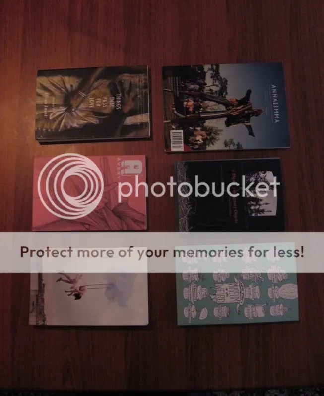
First row, L-R. I know it’s a journal and not a book, but I’ve always loved the energy that the staff at Annalemma, and especially Print Designer Jen O’Malley, put into their journal. Landesberg Design did an incredible job with the jacket of Tina May Hall’s debut collection. FC2 always has great covers, but I especially loved Zach Dodson’s cover for MOTW.
Second row, L-R. When I talked to her about her debut collection’s design, Allison Amend was especially pleased with its “French flaps.” But that cover! It’s by Nancy Racina Landlin, and it’s such a perfect fit for the collection’s subject matter. The last book on the right is by Caketrain Press, whose journal is always a lovely artifact. But the reason I bought it (aside from some prodding by Matt Bell) was the cover photo by Maia Flore. I figured if I didn’t like the book, at least it would look good on my shelf. Fortunately, Matt was right and the stories were as weirdly engaging as he said.
I’m doing this out of order because I’m in the journal, but Avery hired Abi Daniel, an Austin-based artist, to do the artwork for their seventh issue. When I saw the drawing that accompanied my story, I was a little unsettled by how closely it resembled its real-life counterpart. I’d never met Abi before and never really described what my grandparents’ house looked like in the story, but somehow she knew. But the fact that someone was inspired by my story and sat down to create art in conversation with it–that was one moment when it really felt like I’d made it as a writer. I know there are a ton of people I should have mentioned: Henry Sene Yee springs to mind, especially for Steppenwolf. Jay Ryan’s cover for The Final Solution.
I should also mention that solid graphic design costs money, and these publishers should be commended for the time and money they spent to make the books look this great.
At any rate, feel free to make shout-outs in the comments section. Later this week, I’ll post my interview with Rebecca King, founder of Origami Zoo Press, about designing Brian Oliu’s chapbook Level End.

Thanks for the shout-out!
If the books inspires then I’m inspired. If it doesn’t, I just have to dig deeper.
That’s a good way to look at it, Henry. I should also say that the only reason I read “The Glass Bead Game” was for the design and the cover. I absolutely needed it on my shelf.